
SELF-BRANDING: LONDON SULLENS AS A BRAND
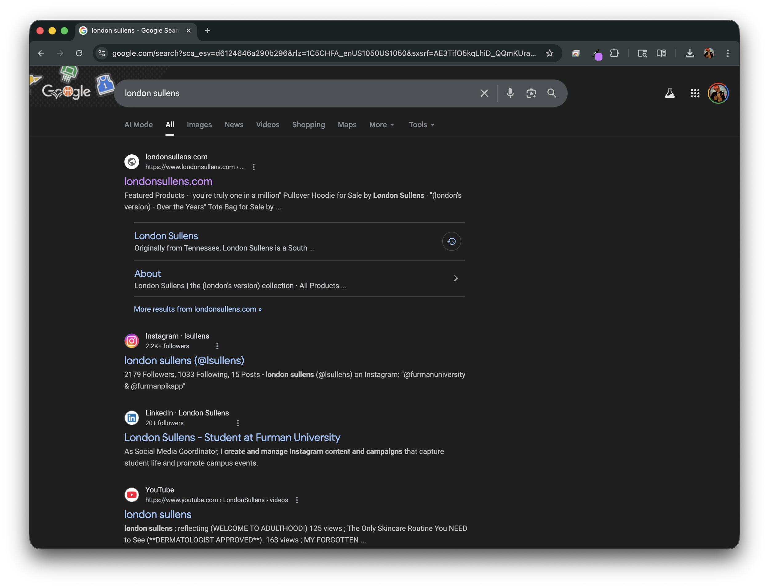
A windowed capture of the search "London Sullens," 2025.
Googling yourself can be scary... But it doesn't have to be.
Recently, I was asked to type my name into a search bar and analyze the results. So I did just that. In Google, I typed "London Sullens," and to my surprise, my high school career highlights, my mom's name and job address, and my old website all came back. Although I thought the phrase "When something hits the internet, it's there forever" was an extreme exaggeration, this simple web search reinforced its truth. When I opened the "Images" tab in Google, I was met with a plethora of Instagram posts, old blog entries, and YouTube thumbnails from years ago. Although I am proud of the work I've done in the past, after Googling myself, I realized two things:
I need to work on my brand cohesion.
I really wish my junior year of high school yearbook photo would vanish off the face of the earth.
What did I find out about London Sullens?
London Sullens isn't just a brand; he is a person who recently graduated from high school and is currently open to work on LinkedIn. Many of the things I found pleased me; however, some did not. Firstly, I was extremely pleased to see that my website SEO is working, and when you search my name, you are directed to my updated website, not just my old one (although they are on the same domain, https://www.londonsullens.com). Furthermore, I also enjoyed seeing my YouTube thumbnails from videos I filmed in high school. Although I constantly talk about how difficult high school truly was, I do find joy in watching those old videos and reminding myself never to stop creating and improving. Finally, I also enjoyed seeing the Furman Instagram post declaring my minor in Women's, Gender, and Sexuality Studies. Yes, there were many positives; however, some negatives detracted from the overall search query. I saw many of my old logos, profile pictures, and stories that no longer accurately reflect who I am. Some baby photos are cute, but as my whole brand? I want to go for something more leveled with fun and professionalism. I was more pleased than displeased with a simple web search of myself, but I still feel like there is some work to be done on my personal brand to capture my image today truly. Today's London Sullens brand is fine, but it does not align with my primary design goals. Dark greens and simple, indented Helvetica ran their course, so today I'm hoping to channel a new brand and welcome a new look into my digital space.
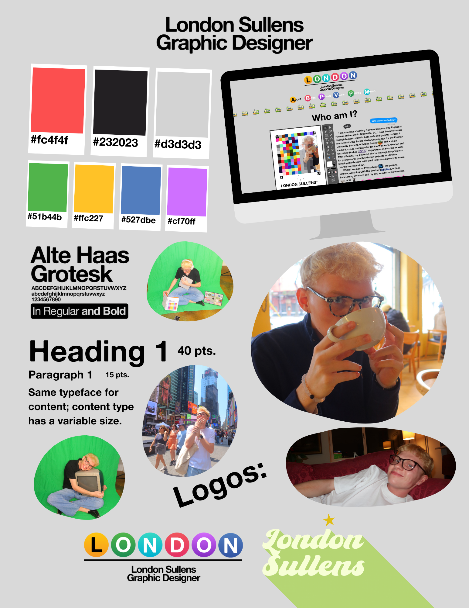
London Sullens’s Digital Mood Board, 2025.
“So, what does a new London Sullens brand look like?"
I've always wavered back and forth about what I wanted my brand to convey; however, I think I've truly instilled my personal mantras in this iteration of London Sullens. Utilizing vivid, bright colors draws readers in to learn more while making them feel comfortable. One of my signature primary colors, a washed red, does just that. In "The Designer's Dictionary of Color," Sean Adams explains, "Many designers shy away from such an extreme color, but red is one of a designer's most valuable tools to create dynamic contrast" (83, 2017). By using a bold red color, I hope to grab readers' attention and contrast the darker blacks and lighter grays used across the site. Color is such an important tool, but I believe that each one I've selected plays an integral part in creating a colorful design tapestry. Similarly, I wanted to choose a bold font. Boldness has a rugged connotation, but I wanted to give the term new life with the font "Alte Haas Grotesk Bold." Originating in Germany and based on Helvetica (my ex-signature font), "Alte" features feathered edges that redefine the meaning of a "bold" font. This typeface perfectly encapsulates my personal brand: rooted in something so signature yet with its own twist to redefine meaning. To maintain cohesion, I selected a single font for the site. When content changes, instead of changing the typeface, I change size and color. I originally saw "Alte" used in Nickelodeon's kids comedy Game Shakers in 2016, and something just seemed so perfect for my personal rebrand. Although my headshots are incredibly outdated and I am overdue for a reshoot, I used some of my favorite travel photos and a green-screen shoot I did in August, 2025. Each of these photos perfectly encapsulates my brand's mission: bright colors mean potent design—images I've strategically selected to accent my primary colors and typeface.
Go explore the new “London Sullens” brand!
I am incredibly pleased with my refined brand. Inspired by the New York City Subway System, my online design portfolio perfectly encapsulates the fun professionalism I bring to every design endeavor. Although I will need to continue publishing content to "block" the old iterations of my brand, I hope to roll out this new brand across my various social media platforms. Hopefully, the finicky SocialBlade page will finally update. However, I'm not sure if I could ever truly rid myself of my 2023 yearbook photo. Oh well!
sources & references
Adams, Sean. The Designer’s Dictionary of Color. Abrams, 2017, fliphtml5.com/zwzgb/fara/basic. Accessed 14 Sept. 2025.
https://www.instagram.com/p/DIPG9CTuWJm/
https://en.wikipedia.org/wiki/New_York_City_Subway
https://socialblade.com/youtube/handle/londonsullens
https://gameshakers.fandom.com/wiki/Game_Shakers_Wikia
https://linkedin.com/in/lsullens